A picture that speaks 100,000 words

Eight seconds is all you have. Eight seconds for an image to persuade the average reader to take a chance on your book. If it doesn’t hold her attention for at least that span, her eye would have found another distraction, studies have shown.
Imagine writing 100,000 words and conveying its essence through a visual on a single page — the cover! Designing an attractive book jacket is a long, slow and iterative process. While there are numerous online readymade book covers, a unique cover stands a better chance of grabbing eyeballs.
So, let me explain the process we followed for designing the cover of my book The Invisible Majority.
First, let me make it clear that the final decision of the book cover is with the publisher, not the author (although ideally it would be a mutual agreement). Publishers know the market inside out. They also know what would best resonate with the reader. Hence it is wiser to trust their decision. However, you could always give them options.
I wanted to provide compelling design options for my book cover. I was fortunate to know two outstanding designers Sriram Jagannathan and Tanya Pradhan who were keen to contribute and support my book in their own capacities. Sriram was the co-author & illustrator of my previous graphic novel GRIT and Tanya was one of the Inclusion Fellows and a colleague at SAP. So, I briefed both of them about the book and also sent them the draft manuscript to read.
After multiple discussions, I saw some initial designs. While they were all good, I was not entirely happy. We went back and forth for months and were on the verge of giving up as we were running out of time. We had almost left it to the publisher to come up with a cover design when the two designers each submitted a sample that looked extremely promising. One was from Sriram and seemed to suit an academic book, while the other, from Tanya, fitted the non-academic category. We sent both designs to the publisher. They had an internal discussion and decided in favour of Tanya’s non-academic looking cover. The reason was that the book is to be marketed and promoted as the first comprehensive non-academic book about disability in India, hence the need to appeal to the general reader.
Here, in Tanya’s own words, was the thinking behind the cover:
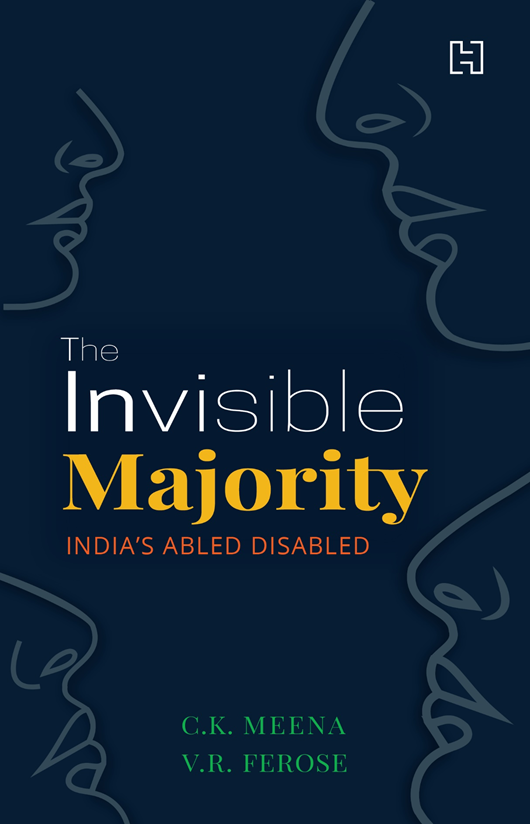
“The cover attempts to shine a light on the largest minority — the PwD community — with its bold dark-ish design balanced with bright, sunny typography. The ambiguous identity of the stark silhouettes suggests different faces of ability, disability, caregivers, NGOs and rights activists, leading to an open interpretation that it could represent any one of us! The illustration focuses on the nose and lips, hinting that the humans facing one another are trying to spark a long-overdue dialogue about the changing attitudes towards this community. And it gracefully leaves out the eyes to subtly express the absence of sight/perspective about the community. This makes them almost hidden, thus complementing the title, The Invisible Majority. The word Invisible is fading, to indicate invisibility. The word majority is in yellow because that is the India Inclusion Foundation color. It was inspired by Dr Arun Shourie’s suggestion — to build a Yellow Pages equivalent of champions of the inclusion movement.”
While Sriram’s cover never made it to the final round, I liked it immensely and am proud of the outcome. I am grateful to him for his time and effort. Let me add that the entire process took 4 months before we arrived at the cover you see before you. I do not want to burden you by narrating the prolonged technical to-and-fro between Tanya and the publisher (on colors, font sizes, dimensions and other details) to fine-tune the design of the jacket.
I am confident that this cover page will make many a reader’s eye linger on it for more than eight seconds!

Here is the explanation of the cover by Sriram:
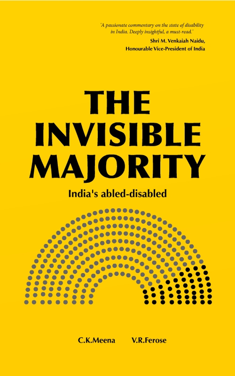
“The cover design shows an infographic-styled ratio between PWD and non-PWD. The black represents PWD, while the dark grey represents non-PWD. The dark grey is used here only for representation, we’ll have to get it as reflective material. The reflection of the reader is to indicate the three points.
- Even if we have no disability today, we will inevitably acquire one tomorrow. All we have to do is live long enough.
- The disabled are a majority because every one of us is liable to join their ranks.
- Because disability, which will touch all of our lives, should be of concern to us all
The infographic is like the ones we see in a parliament. This is to show we are all decision makers in some way or the other when it comes to this topic.
I’m starting with the man in the mirror,
I’m asking him to change his ways,
And no message could have been any clearer,
If you want to make the world a better place,
Take a look at yourself, and then make a change”
There are so many books being published that it is hard to remember any book covers. But a real good one will remain with you for a long time and I hope The Invisible Majority is one of them!
PS: If you have not pre-ordered the book yet, here is the link. Thanks to all your support, the book is #1 bestseller in Amazon India. The book will be available globally on Amazon after Dec 3rd.

